Cortland Harvest
Sections
Overview
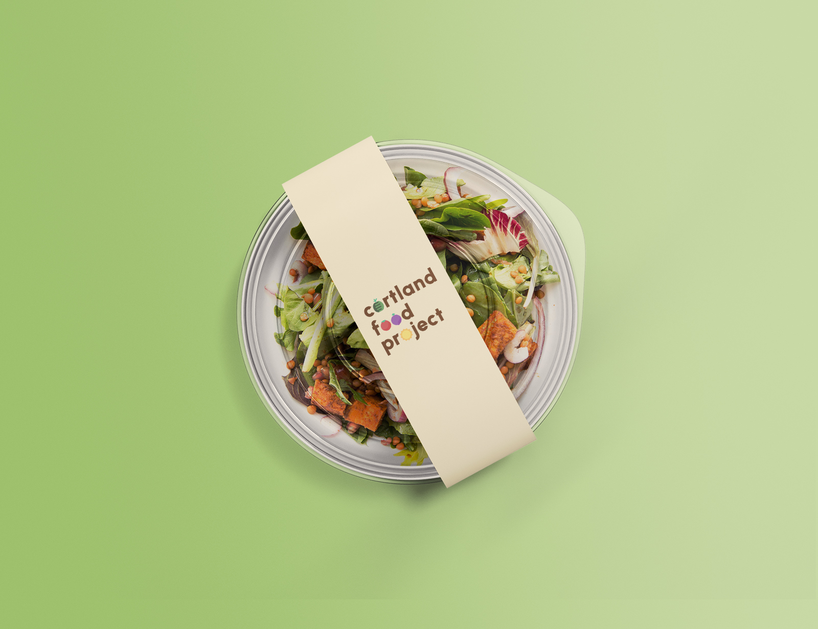
The project consists of creating a visual identity for a local produce and agriculture initiative.
The team at Seven Valleys Health Coalition wanted a new logo for Cortland County Agriculture that is appealing to millennials and promotes buying local produce and agritourism, as well as supporting local farmers and local economy.
Deliverables
A set of logos and visual brand guidelines with logo specs and variations, color palette, and typography.
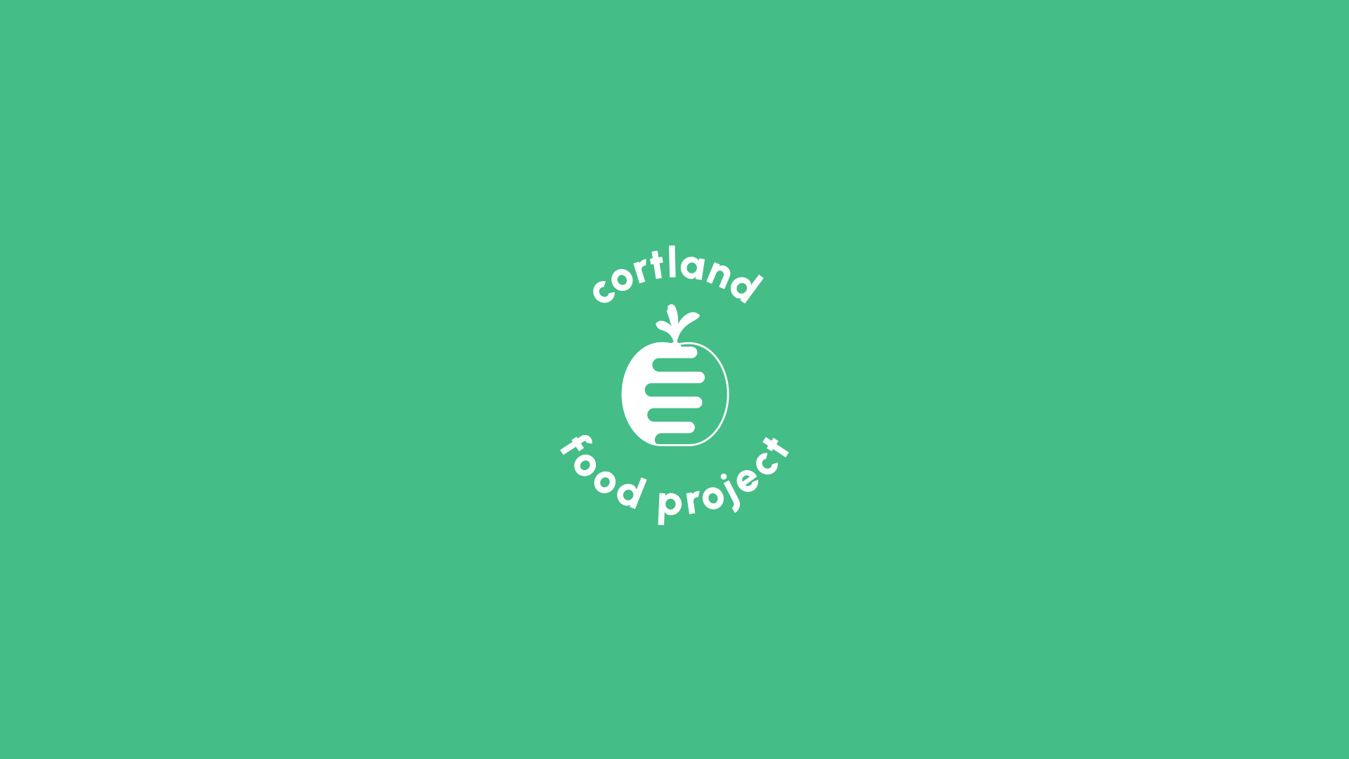
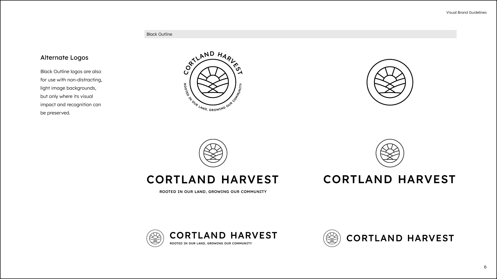
Logos
Standard, simplified, and various lockup orientations in the brand's primary colors, alternate-use colors, and grayscale-use colors.
-
Standard logo


-
Simplified logo


-
Vertical lock-up


-
Vertical lock-up with tagline


-
Horizontal lock-up


-
Horizontal lock-up with tagline


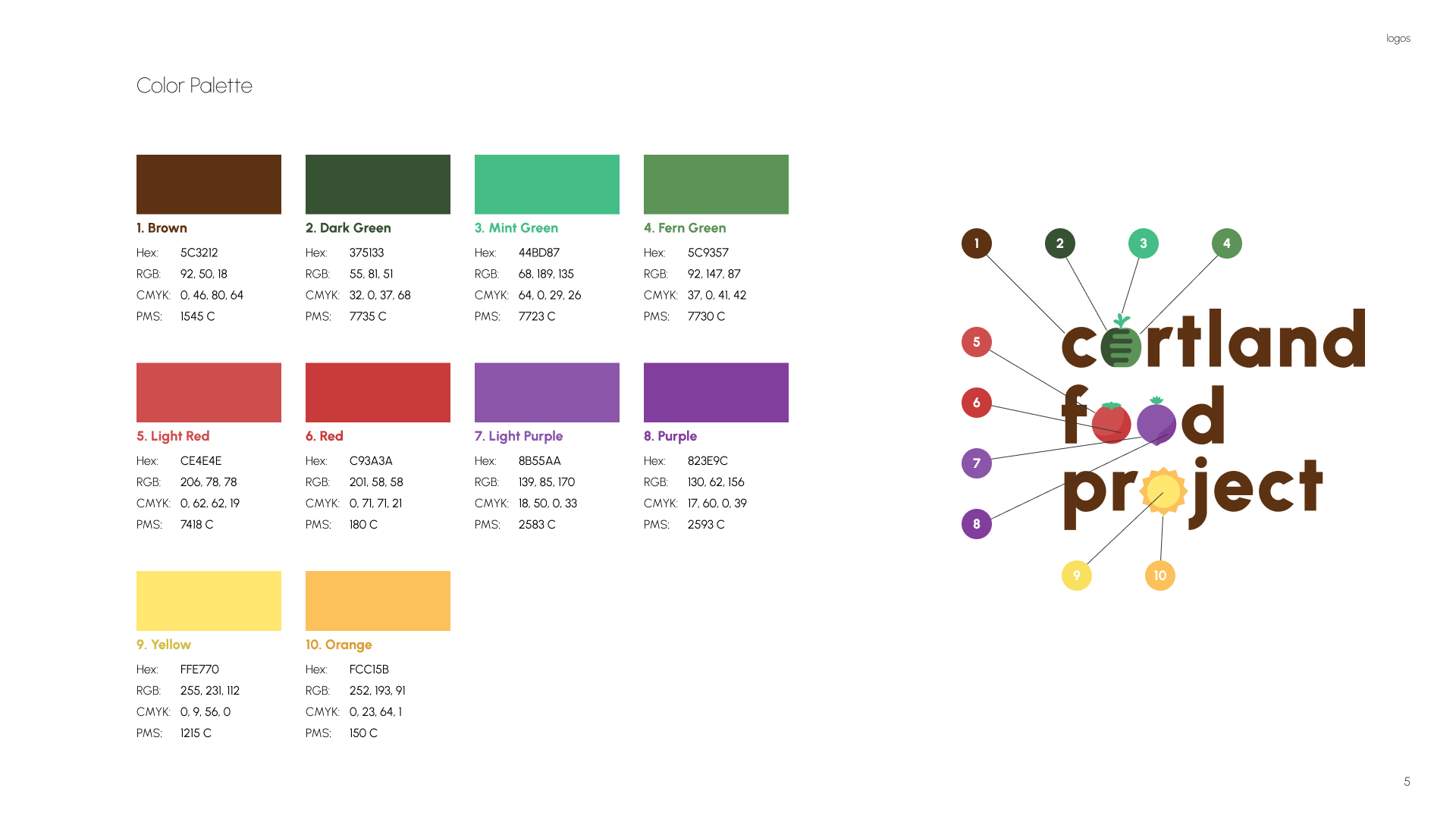
Visual Brand Guidelines
Describing the logo's meaning, its variations and alternatives, how to apply and set, and the colors and typography.
-
Alternate logos page
-
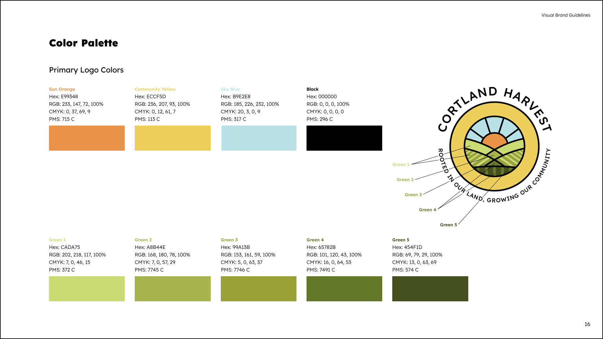
Color palette page
-
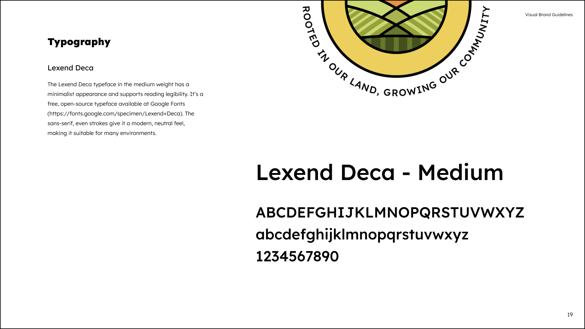
Typography page
Process
The project spanned 8 months but included a break in between where the team at Seven Valleys Health Coalition asked their community for feedback and selection.
Finding an Identity
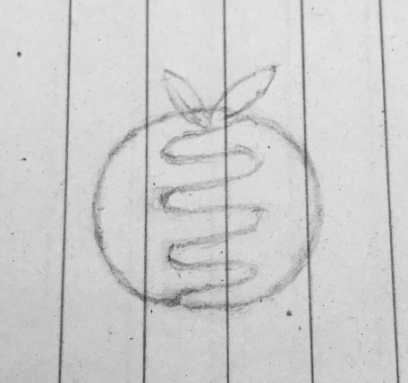
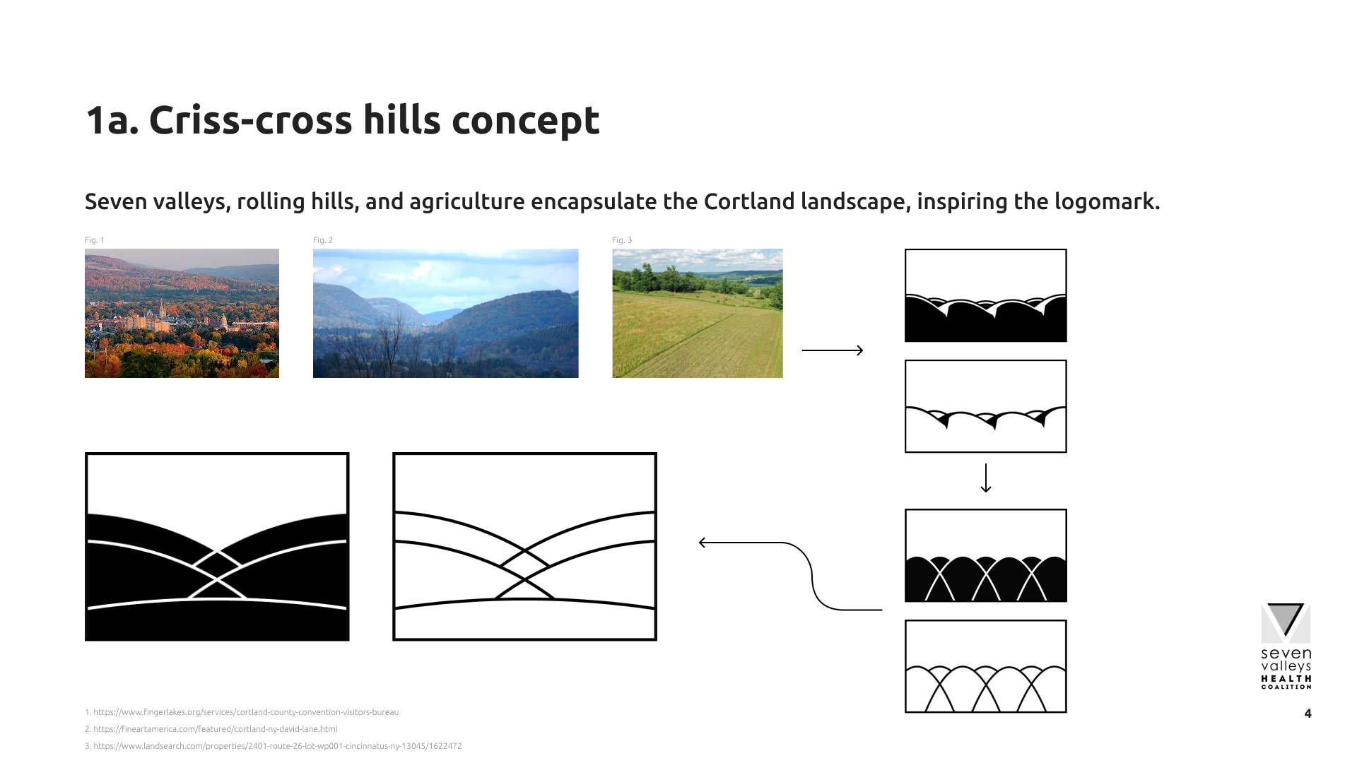
For the first phase we met on a weekly or bi-weekly basis for feedback and discussion on the new branding effort. Through a provided research branding report and a series of meetings, themes around 7 valleys, the sun, and agricultural growth, as well as a minimalistic aesthetic surfaced as traits the team wanted the new symbol to have.
Illustrative and geometric ideas


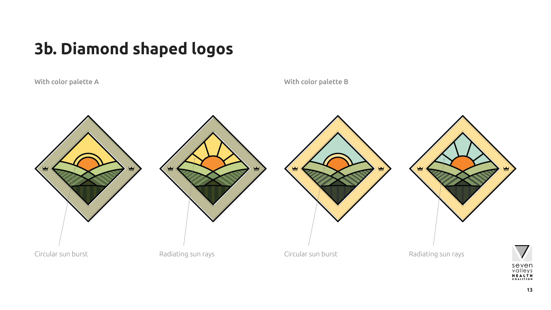
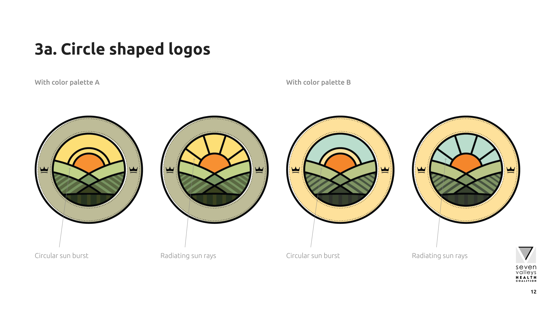
Providing options
A combinations of the different attributes selected by the team was put together so that their community could have some input.
-
Idea explanation
-
Diamond shape logos
-
Circle shape logos
Finalizing the design
After a break of over 3 months and with the community feedback, the design with the logo enclosed in a circle without crown icons became the final design. The color palette increased in saturation and warmth, conveying a ripe and fresh feel the organization was going for.
With a chosen brand name and tagline, the typography was set and kerned.